Imagine The Godfather with Don Corleone bound in silk ropes, or Pulp Fiction’s dancers locked in a steel cage. What happens when the silver screen meets the dark room?
From the lurid grindhouse prints of the 1960s to today’s glossy streaming thumbnails, BDSM imagery has long been a visual shorthand for transgressive desire. Film titles and promotional posters act as cultural signposts, instantly communicating a movie’s tone, genre, and market positioning. By dissecting the visual language of these materials, we can trace how society negotiates the line between representation and exploitation, and how the fetishization of power dynamics has evolved—or remained stubbornly static—over the past six decades.
Movie posters are already designed to seduce. Bold typography, dramatic lighting, a single frozen moment that screams “watch me.” BDSM art thrives on the same principles: tension, power exchange, anticipation. Merge the two, and you get visual dynamite.
Historical Context: The Rise of “Sexploitation”
Late 1950s – early 1970s
Low‑budget productions, sensationalist taglines, overt sexual innuendo. Posters relied on provocative stills rather than sophisticated design.
The Story of O (1975), Vampyres (1974)
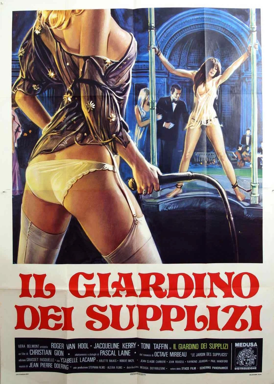
Mid‑1970s – early 1980s
The “grindhouse” boom; exploitation sub‑genres (blaxploitation, women‑in‑prison, BDSM‑exploitation). Posters began to use stylized illustration to amplify taboo themes.
Killer Nun (1979), The Devil’s Playground (1976)
These eras demonstrate a move away from blunt, sensationalist shock tactics toward subtler, occasionally romanticized depictions while the core visual symbols still center on power dynamics, confinement, and sensual tension.


Visual Grammar of BDSM Posters
The visual language of BDSM‑themed film posters boils down to a few recurring cues:
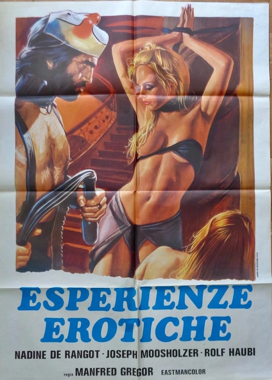
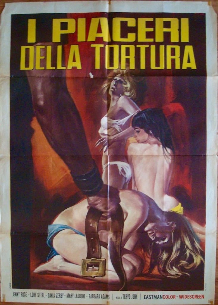
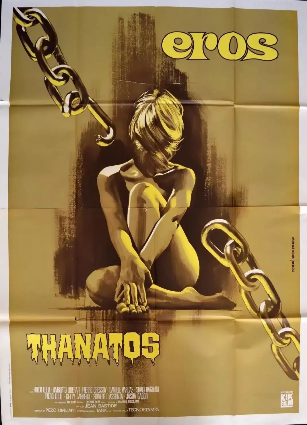
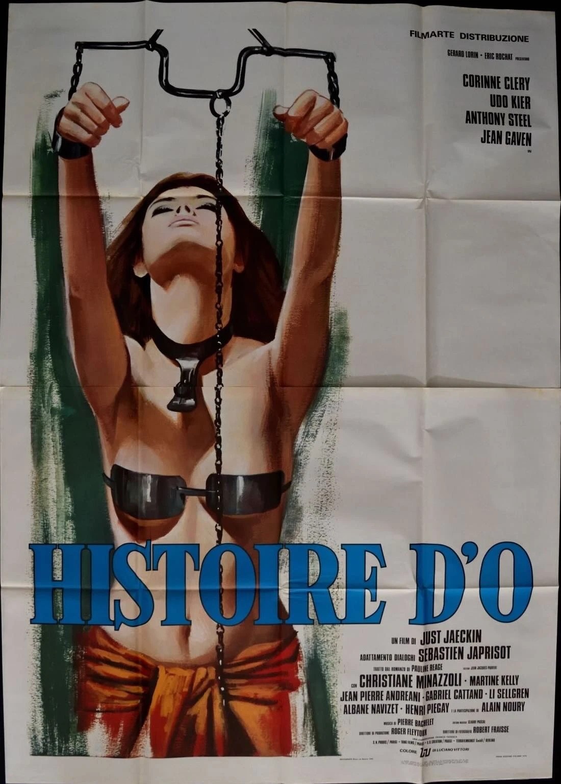
- Props: Ropes, chains, cuffs and leather/latex gear appear front‑and‑center, creating a sharp contrast between hard restraints and soft flesh and instantly signalling bondage.
- Body positioning: A dominant figure is placed higher or larger, often looking straight at the viewer, while the submissive is crouched, bound, or averting gaze—visually establishing a power hierarchy.
- Color palette: Classic exploitation uses bold reds and blacks for danger and lust; newer designs favor muted earth tones or desaturated hues to suggest psychological nuance rather than raw shock.
- Typography & taglines: Heavy, blocky sans‑serif fonts and blunt slogans (“She’s bound to obey”) reinforce raw intensity, whereas sleek serifs or scripts paired with subtler copy hint at sophistication and romance.
These elements combine to convey BDSM themes quickly, while also reflecting the shifting cultural balance between fetishistic exploitation and more nuanced, consensual portrayals.
Cultural Perception: Fetishism vs. Exploitation
Consent
Early exploitation‑era posters rarely hinted at any kind of mutual agreement between the participants; they focused instead on the sheer shock of seeing someone bound or restrained. Because the imagery emphasized the act of domination without showing any indication that the submissive party was willing, audiences tended to interpret these films as pure exploitation, sexuality was being used solely as a sales hook rather than as an expression of consensual kink.
Psychological Depth
Later designs began to soften the visual language. Subtle facial expressions, softer lighting, and less overt displays of bondage started to appear. This shift signals an interest in exploring the inner emotional landscape of the characters, inviting viewers to empathize rather than merely voyeuristically observe. Consequently, the cultural reading moves toward seeing BDSM as a nuanced, psychologically rich subject rather than just titillating spectacle.
Gender Dynamics
Historically, the dominant figure on a poster has been male, while the female body is positioned as the object of desire and subjugation. This visual hierarchy reinforces traditional patriarchal fantasies, aligning BDSM imagery with male power fantasies. The repeated portrayal of men in control and women in submission perpetuates a gendered reading that many critics argue limits the broader possibilities of consensual power exchange.
Queer Visibility
More recent posters occasionally feature gender‑nonconforming models or ambiguous pairings, reflecting a growing cultural acceptance of diverse sexualities. While mainstream marketing still leans heavily toward heteronormative representations, these inclusive visuals signal a gradual shift. They suggest that BDSM is not confined to a single gender binary and open the door for broader recognition of queer and nonbinary experiences within the kink community.
Conclusion
Film titles and posters are more than marketing tools, they are cultural artifacts that encode (and sometimes challenge) the prevailing attitudes toward BDSM, fetishism, and exploitation. By decoding their visual grammar, we uncover a story of gradual legitimization tempered by persistent sensationalism. The future of BDSM representation will likely hinge on whether creators continue to prioritize authentic, consent‑centered storytelling over the easy lure of shock value. As audiences become more media‑savvy, the demand for respectful, nuanced portrayals grows, promising a richer, more honest dialogue between cinema and the diverse communities it depicts.